Buttons and links can make or break a user’s digital experience. After all, if a user doesn’t know where to click, they aren’t going to. There are four key considerations when dealing with buttons and links, Specific, Sincere, Substantial, and Succinct. Today we will be discussing how substantial links and buttons in your navigation elements improves user experience.
Stop in the Name of UX
On the digital superhighway, a button is a stop sign. We’ve established in this series that users tend to scan pages while seeking the information they want. Buttons and links are used to temporarily interrupt the scan, pause, and turn the user on to a newly available path. The user can then turn on to the new course or keep scanning. Like a stop sign, buttons need to be substantial enough to be easily seen and easy to identify. Consistency in shape, color, and style are also critical for your button and link strategy to be successful.
I Am What I Am, and That’s All I Am
Research has shown that many users scan headlines, buttons, and links often without reading any surrounding text in a digital experience. These buttons mustn’t be buried in the text that users very often do not read. The simplest way to have a button stand out is not to get overly creative with the button styling. That is, make it look like a button. In the early days of the internet, that would mean shading and beveling that would give the appearance of a 20th century control panel button. Thankfully that look has gone out of trend. It has been replaced with more simplified two-dimensional buttons that stand out as a place of interest. The key is to keep the shape simple and defined and positioned in a place that is easy to find.
Color Me Impressed
Another simple way to bolster buttons and links is with color. Not only should buttons and links stand out from the text that surrounds them, but they should also pull focus when scanning the site. There is a growing trend in brand and website design that revolves around a monochromatic color palette. This technique can create an attractive display but can cause your buttons and links to blend into the sight. The goal is to stand out. Instead of keeping the buttons tied to the monochromatic theme, it would improve UX if the buttons were presented in a complementary or variant color. Some sites use a background image or colors. It’s crucial that the button pops off the background and grabs the user’s attention. Keep at least an 80% contrast between the link and the background on which it appears. Remember text links are usually blue, so never color non-link copy blue.
Size Matters
It’s also important to consider size when developing your button and link style. The task of right-sizing your buttons creates a Goldilocks effect. Too small, and your buttons and links won’t be readable. Too large, and they won’t be identifiable as a button. The trick is to find a size that is just right. The other trick is that the size is just right across various screen sizes, including monitors, tablets, and smartphones. One way to test whether a button or link stands out is to use the squint test. Squint your eyes at the page and determine what stands out among the visual elements. Those are the areas where your users will focus.
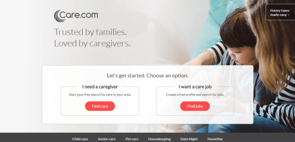
Notice how this design utilized size, contrast and color to make their buttons stand out.
Trust Me
Lincoln Chafee said, “Trust is built with consistency.” Your buttons and links must have consistency throughout your site to build trust with your users. Since the goal is to create a meaningful and straightforward experience for your users, make it easy to find your buttons by developing a button and link style that is maintains the same button size, shape, and font style throughout your site.
In Summary
Buttons and links need to stand out on your page and be readily identifiable. Creating great user experiences includes well-designed buttons that are easy to find, easy to read, and consistent throughout your site.
Happy Holidays and stay tuned as we countdown the 12 Days of UXMas!
Feel free to leave feedback, ask questions, or make additional suggestions in the comments.