While buttons are small, these user experience elements contribute in a big way to your content’s discoverability and accessibility. There are four key considerations when dealing with buttons and links, Specific, Sincere, Substantial, and Succinct. Today we will be discussing how specificity in your navigation elements improves user experience.
Learn More
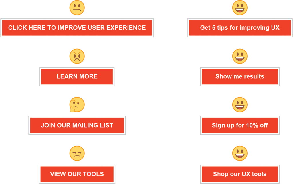
You see it all the time. A button that says, “Learn More.” Often repeating over and over again across the page. You read a short blurb on a product, and there’s a button that says, “Learn More.” There’s a callout that mentions an email subscription with a button that says “Learn More.” Ten years ago, this button would have said, “Click Here.” If “Click Here” was a font, it would be Comic Sans. It’s a joke in design, UX and development communities, and adding a “Click Here” button to your site is a great way to look out of touch with current trends. After all, when 50% of your users are mobile, are you clicking or are you tapping? The trouble is “Learn More” is quickly becoming the next “Click Here.” It’s confusing and vague.
Wash. Rinse. Repeat?
Vague links and buttons like “Learn More” are overused. Have you ever repeated a word so many times it loses its meaning to the point it’s hard to say? Try reading your page out loud from top to bottom or use a screen-reader and have it read to you. How many “Learn More’s” does it take before you are tired of hearing it. How many more times until it is rendered meaningless to the point you don’t hear it at all? Imagine how your users feel. Mix it up. Your users will thank you.
You Are the Weakest Link … Goodbye.
Weak buttons and links can make even the best content fall flat. If a user is not enticed to click and continue interacting with your content, they will feel they’ve hit a dead-end and move on. Consider the questions your users might ask when making a click decision:
- CLICK HERE >>> Why should I?
- LEARN MORE >>> About what?
- SIGN UP >>> What’s in it for me?
- GO >>> Where?
- NEXT >>> What!?!
It’s all very confusing when you look at it from the user’s perspective. As stewards of user experience, we should focus on clearing up this confusion as much as we can.
What’s In the Box?
One key to a more successful UX is to communicate openly about what will happen, what will be discovered, and the benefit to the user on the other side of the click. Be specific. Here are some alternatives to “Learn More” and other insincere button descriptions that will offer your users more insight into what happens next:

Rank and File
We’ve established the benefit to overall user satisfaction and engagement when users are armed with more specific buttons and links, but the benefits don’t stop there. Google reads your content in roughly the same way your users do. Repetitive and vague link descriptions can hurt your searchability and page ranking. Don’t waste an opportunity to further optimize your page by peppering keywords about your product and expertise in your page’s strategic areas.
Better For You. Better For All.
Context also adds essential benefits to accessibility. Accessibility features are a growing area of importance for organizations as more and more accessibility features become standard requirements. “Click Here” and “Learn More” force all users to carry a more extensive cognitive load, but for the visually impaired, these vague cues become practically useless.
In Summary
Buttons and links are critical elements to user experience. Before users click, they need to understand what is going to happen next. Being specific in your button and link descriptions will increase engagement with your page and have the added benefit of better page accessibility and searchability.
Happy Holidays and stay tuned as we countdown the 12 Days of UXMas!
Feel free to leave feedback, ask questions, or make additional suggestions in the comments.
