
Since most users will scan the information and only read the portions that matter to them, it’s essential to keep your content interesting. Using various visuals and meaningful text is as critical as other design choices such as font type and size.
Fonts
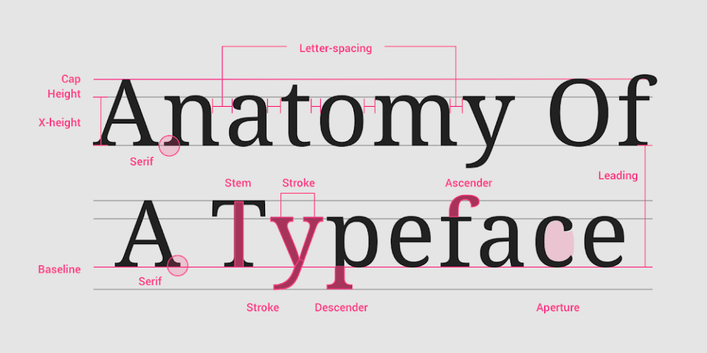
One key element of readability is font selection. There is an endless supply of fonts available for digital experiences in all types, costs, quality, and effectiveness. The primary focus when selecting fonts should be readability. Also, the chosen fonts should come in a variety of styles and weights. Headline fonts should grab attention, while body copy fonts should be clear and concise at various sizes to accommodate multiple screen sizes. It’s best to evaluate all the characters of a font. Are the lowercase “L,” uppercase “I,” and number “1” distinguishable from each other? How is the ampersand styled? Is the lowercase “A” single or double story? Familiarizing yourself with the subtle and unique qualities of a font can help determine how easy these fonts will be for your users to read.
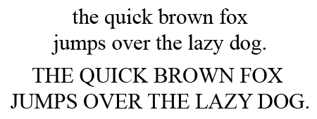
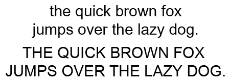
To Serif or Not To Serif
In digital environments, font choices are critical. Decorative fonts and their whimsical qualities are useful in some cases, however, these fonts are usually pretty hard to read and should be avoided as a primary design element. When choosing a font for body copy, users have two decisions to make, serif or sans-serif. Serifs are small protrusions on a font’s characters intended to direct the eye from one letter to another. Sans-serif fonts, as their name suggests, do not have this feature.
Traditionally, designers preferred sans-serif fonts or digital spaces because the serifs did not always replicate well on screens. Over the years, an unwritten rule emerged that serifs were for print and should be avoided in digital spaces. But, with the increase of quality of screen resolutions over time, this rule has become outdated, and the sea of sans-serif across the world wide web is slowly but surely beginning to become more diverse as quality monitors allow designers to make more interesting font choices.
Size Matters
Text size is determined by how the copy is intended to be displayed. In print, standard text sizes for copy have been pretty consistent for generations, but those standards do not translate to digital spaces. Current best practices in digital environments recommend a minimum of 16px for body copy. While that would only be appropriate in print for a “See Dick Run” style book for early readers, on websites and apps, this size works well on screens of all sizes, even smartphones.
Get the Lead Out
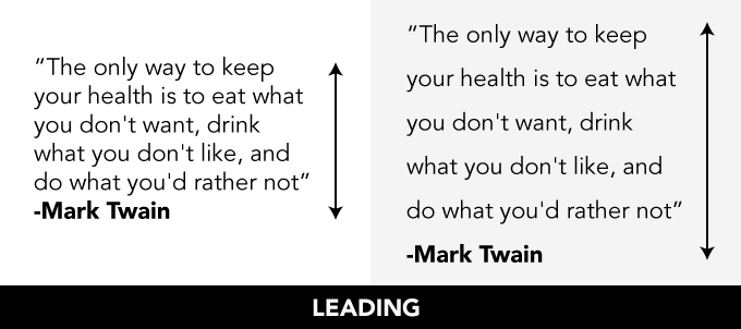
Another place to improve the readability of the text is with the vertical spacing in the body copy. Leading is the space between lines of text. Aptly named “leading” due to the thin strips of lead that early typesetters used to separate copy lines. When lines of copy are set too close together or too far apart, they become difficult to read. For my eye, the sweet spot for leading falls between 120%-150% of the font size. For 16 px body copy, the appropriate leading should fall between 19 and 24 px.
Vertical Leap
The other vertical spacing to consider is paragraph spacing. Paragraph spacing is the vertical distance present after one paragraph end, and another begins. Giving the user a visual break at the end of the paragraph improves readability by encouraging the reader to take a brief pause. This pause is also beneficial for users scanning material because the paragraph spacing lets the user quickly find new bits of information to investigate by adding separation between topics. Provide users a break between paragraphs and before headlines, subheadlines, number lists, and bullet lists.
“X” Marks the Spot
The x-height of a font is the height of the lowercase “X”. Since most lowercase letters fall within the x-height, it is an essential measurement for readability. A font with a larger x-height can be read more efficiently, even at smaller sizes. It’s a good idea for mobile screens and application design to choose a font with a larger x-height. For smaller screens, it’s also a good practice to avoid condensed fonts and italics.
A responsive design is critical for a design to display across multiple screen sizes. Usually, designers focus heavily on the responsive design of a page’s graphics and images. However, it’s equally important that your text scales well when viewed on any device. While headlines may need to scale slightly smaller for mobile screens, body copy may need to scale larger. These small adjustments in text size can significantly impact a layout and may require limiting how much information you leave on the mobile environment page.
Keep It Simple
Copywriters should carefully consider how they “speak” to users. Heavily sales-driven copy or overly technical text can also be a turn-off for users. Since buzz words are overused, they can become white noise to consumers. Instead, use words that give useful information to inform your audience. Your copy should have calls to action, but users can become uncomfortable if you are too aggressive with the close. It’s essential to engage your consumers with a more conversational tone. For consumer-focused text, you’ll want to keep your text at an 8th-grade reading level. Keep your content tightly grouped and segmented by topic. If you have a long text block of information, try to make things easier to read by breaking up the text into small paragraphs with one topic per paragraph. The addition of sub-headlines and lists to display longer bits of information can also help users find the information they want faster.
In Summary
Readability isn’t only about whether or not your user can read your page, it’s also about whether they want to read it. To provide the best user experience, choose a font that fits within your brand but is also very easy to read. Write with the consumer in mind and then organize the content in easy to scan chunks.
Happy Holidays and stay tuned as we countdown the 12 Days of UXMas!
Feel free to leave feedback, ask questions, or make additional suggestions in the comments.