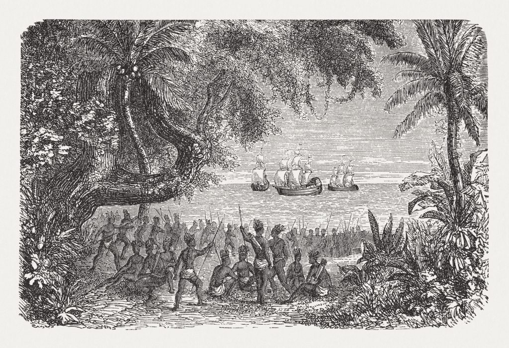
In 1492, Christopher Columbus searched for a new trade route to Asia in an effort to deliver spices to Europe, including pepper which was highly prized by Europeans. During the “buscar el levante por el poniente” (seek the East by way of the West), Columbus instead ran smack dab into San Salvador. Columbus immediately assumes he has successfully arrived in India. He goes as far as to call the indigenous people he meets “Indians.” But soon, he begins to realize something is awry. Since Whole Foods wouldn’t show up in the Western Hemisphere for another 486 years, he pretty quickly realized there were no peppercorns to be found. What he does find are Capsicum plants of all sorts. He returns to Spain a failure. He hasn’t found a new passage to the spice islands, and he’s completely pepper-less. His accomplishments include “discovering” a land that already had people on it and no shortage of previous European visitors. So, to keep his head attached to his body, he presents Capsicum berries as a “new” kind of pepper. Today, we call the various berries of Capsicum plants Columbus introduced to Europe “peppers,” chili peppers, bell peppers, jalapeño … peppers. Do you see what he did there? If only Columbus had better navigation, we wouldn’t be eating Columbus’ lies with sausages over penne.
Site Mapping
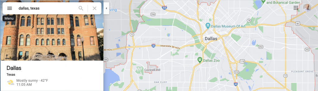
Christopher Columbus was lost and sailing by the seat of his pants. Columbus didn’t know there were two continents between Europe and Asia as he headed west out of Spain. He just started his journey blind. This example represents how users approach a new site. Like Columbus, they have expectations, but it is our job as creators of a digital experience to help navigate the users to where they can find the information they seek. Otherwise, they will end up in the wrong place looking for something that isn’t there.
What’s on the Menu?
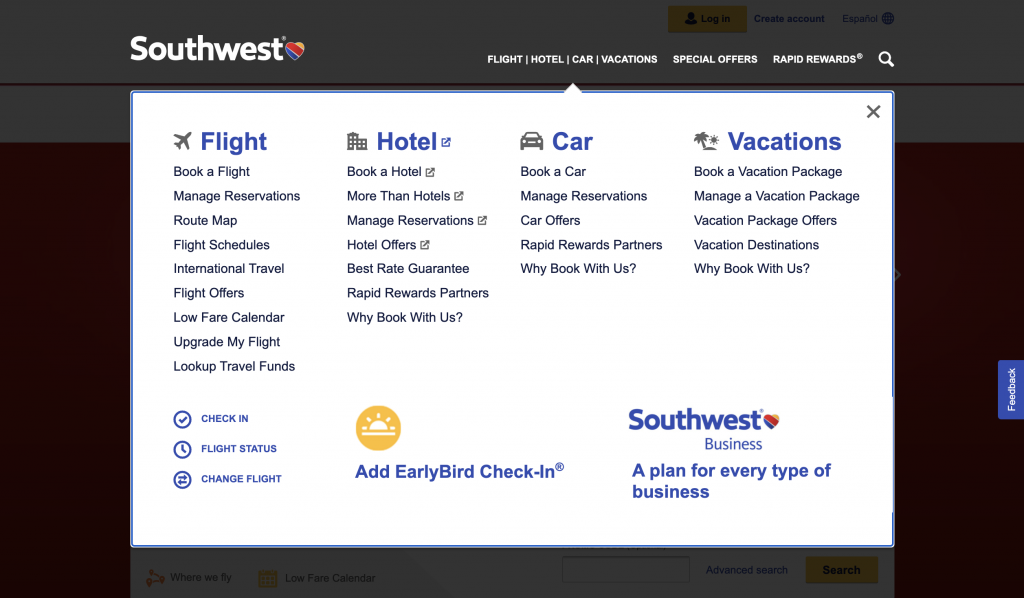
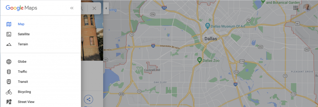
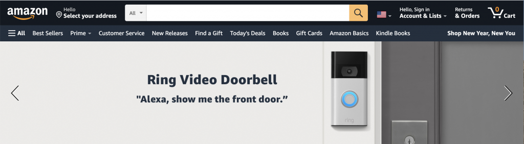
The main navigation element of any site is the navigational menu. The “nav” is the user’s map to the website, allowing them access to what the site offers and how to get there. Site navigation should be straightforward for your users to find and located at the top of the page. Users expect the navigation menu to be the first thing on the page. It is critical users don’t have to scroll and hunt for the navigation menu. With that in mind, navigation should be consistent throughout your site. It should look, feel, and perform the same no matter where the user lands within the website. So, if the user finds themselves in a place they don’t want to be, they can quickly and easily move to a different page. One effective trend for navigation consistency is a sticky menu. With a sticky menu, the navigation is always present on the page no matter how many times the user scrolls down the page. Sticky navigation is especially powerful when a site has long-form content that may require users to scroll multiple times. Once the user is midway down the page and wants to move to a new section of the site, sticky navigation allows them to do so without scrolling back up the page.
Hide and Seek
While well-designed navigation is always present, it is never in the way. Navigation menus should never distract users from the content they are there to see. It’s crucial that navigation is subtle and blends into the background elements of the site. One way to keep your navigation subdued is to keep your navigation labels specific. Limit your navigation descriptions to 2-3 words compacting the most critical information into the first 11 characters.
A Fairy Tale Experience
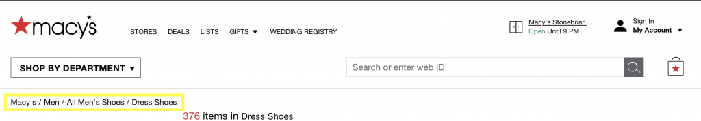
It’s not only important to let users know where they are going; it’s equally important to let them know where they have been. Let users know where they are with the additions of breadcrumbs to your site. Breadcrumbs help users by presenting a clear, click-by-click path of their progress through the site. Just like Hansel and Gretel dropping breadcrumbs while lost in the woods, this technique allows users to navigate deeper into a website without fear of not being able to get back to an area of interest or being eaten by a witch.
The Pecking Order
Another way to condense menus when your site has an abundance of content is to create a website hierarchy. When you have multiple tiers of navigation in the menu, it’s critical to keep things simple. Since it is much harder to scroll horizontally, keep drop-down menus vertical rather than a horizontal hover. It’s also essential to keep your tiers in check. If you have more than 3-4 levels of hierarchy, it’s time to consider a content reorganization. Remember, users are looking for specific content, and they want to find it quickly. Your navigation should help in their search by being precise and helpful, not overwhelming. Keep your drop-down menus narrow enough that they don’t take the entire width of the page. Narrowing the drop-down menu will allow users to click out of your menu easily.
McNavigation
When it comes to mobile experiences, space is more limited. It’s often a good idea to utilize hamburger menus. Hamburger menus are a great way to organize your navigational items while taking up less screen real estate. However, hamburger menus are less familiar and less noticeable to users. If possible, designers should keep the most frequently used navigation items front and center and only hide the remaining elements under the hamburger menu. Navigation hierarchy can easily overwhelm users on mobile screens. If secondary navigation is required, use category landing pages, submenus, or in-page menus to avoid menu congestion on mobile devices.
Don’t Bury the Lead
While navigation is essential, some page elements should never be buried in navigation menus. These items should be front and center on your page and very easy for users to find:
- Login
- Search
- Cart
- Contact
- Home
In Summary
Navigation is the user’s map to your site. Navigation must be concise and clear. Adding functionality like sticky navigation and breadcrumbs help users find their way, so users don’t get lost.
Happy Holidays and stay tuned as we countdown the 12 Days of UXMas!
Feel free to leave feedback, ask questions, or make additional suggestions in the comments.