The peak of the Himalayan Mountain range looms 29,032 feet above the border of Tibet and Nepal. That’s a distance of nearly 5.5 miles. At sea level, walking a similar length would take the average person a couple of hours. So, why does it take expeditions around 60 days to reach the summit of Mount Everest? The answer is flow. To create a better user experience, designers must keep user flow in mind, or else their users will feel like they are fighting an uphill battle.
Gee, I’m a Tree
There is a simple scientific rule discovered by triangle enthusiast and Ionian philosopher Pythagoras in 5th Century B.C. Greece, which dictates that the closest distance between two points is a straight line. While it makes sense that this rule would be prolific outside of middle school mathematics, the truth is, this rule is rarely applied in nature (including human nature).
you’ve seen the path of least resistance in action.
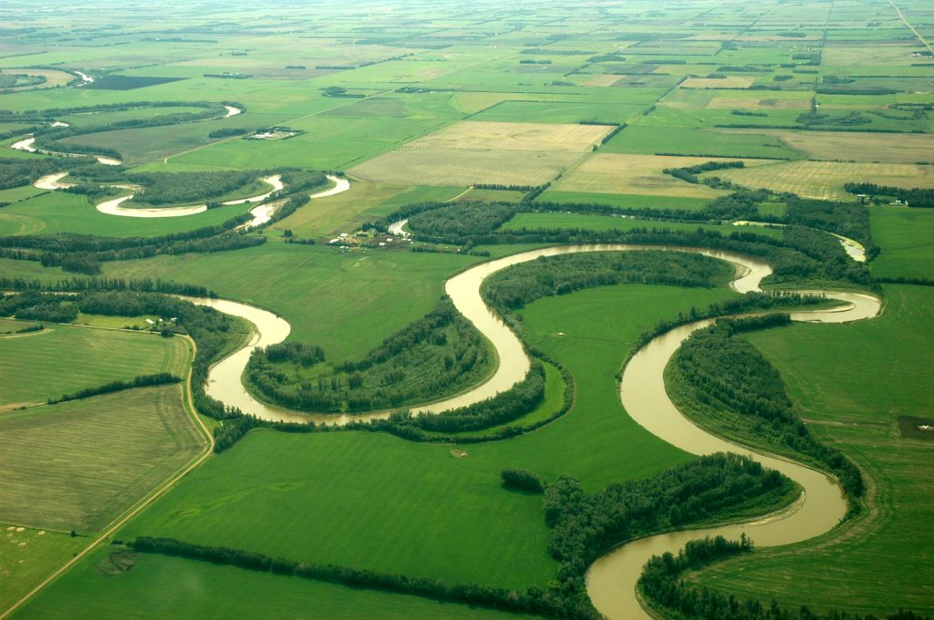
Conversely, nature travels in a non-linear fashion due to a phenomenon known as the “path of least resistance.” Water flows downhill from the pull of gravity, but it does not flow straight. Water twists and turns, choosing the “path of least resistance” rather than a more direct straight line to the sea. Throughout nature, you see this from hiking and game trails, the way a plant grows toward the light, and how users engage with a digital experience. Like water, users choose the path of least resistance. In a digital space, scrolling is often the path of least resistance. Scrolling is faster than clicking, and a navigation element could be seen as a boulder in the middle of the user’s way. Sometimes it’s easier to walk around.
Digital Origami
When discussing user flow on a website, you hear a lot about content staying “above the fold”. Traditionally the “fold” would be the content that shows up when the page loads, which is visible without scrolling. It is essential to get your most important information positioned at the top of the page. However, the fold location will change based on the type of device on which the page is being viewed. In the age of responsive design, scrolling is expected by users, and users will typically be willing to scroll. Studies show 90% of users begin scrolling after being on a page for less than 15 seconds. So while the fold is a significant consideration for designers, it should not overshadow the page flow. Designers shouldn’t force massive amounts of content into a small space solely to keep it above the fold.
This Way Up
One step many designers miss when building their pages is successfully communicating the user path with the audience. If the page has long-form content that falls below the fold, it’s critical the user understands that more relevant information exists. Users will scroll down a page, but only if it is clear. There is a benefit to doing so. Designers should provide clear visual queues that indicate that more content exists to encourage scrolling. The longer the website page, the less likely someone is to scroll down to the bottom. A good rule of thumb is to keep your page viewable within a 1 to 5 scroll range.
A Banner Jeer
It’s also important to use your space wisely. Users will navigate around elements in their path that disinterest them. One common feature that many users avoid is banners. Because many websites have relied upon design elements like homepage marquees, sliders, and banner advertisements, these elements have become white noise to users and are often passed over. Banner blindness occurs when users avoid looking at anything on the page that looks like it could be advertising. It’s essential to keep this phenomenon in mind when designing your page and avoid putting critical content or calls to action in a banner-like form.
Hide and Seek
Another critical feature for improved user flow is a search field. Unless your site is small, a search feature should be considered required. Search fields help remove resistance from a user path by directly taking the user to the content they desire. Your search field must be easy to find. Users expect your search box to appear in the upper right corner of your page. On mobile screens, where space is limited, the search could be represented by an icon, but typically, users are looking for a box or field to type their keyword. Designers should also account for a large enough container that users can type their full query.
In Summary
Readability isn’t only about whether or not your user can read your page, it’s also about whether they want to read it. To provide the best user experience, choose a font that fits within your brand but is also very easy to read. Write with the consumer in mind and then organize the content in easy to scan chunks.
Happy Holidays and stay tuned as we countdown the 12 Days of UXMas!
Feel free to leave feedback, ask questions, or make additional suggestions in the comments.