Have you ever visited a website, watched a presentation, or been handed a piece of collateral and not known where to look? Too much or poorly arranged content creates disorder and confuses users.
Lay It On the Line
One thing that can improve user experience in marketing collateral and digital experiences is the layout. In simple terms, “layout” is the order and placement of text, graphics, photographs, and other visual elements that make up the content of your page.
Getting Some ZZZ’s
For years the industry standard was a “Z-shaped” layout. This layout places critical elements in a zig-zag pattern across the page to imitate the natural eye-flow of reading. A vital piece of content would be positioned in the top left corner of the page to attract attention. Then there would be another element on the far right to draw the eye over. The next piece of content would be down and to the left, and so on. A “Z-shaped” layout assumes that users approach your page as they would their favorite novel, start at the top, then carefully read to the bottom from left to right.
Breaking the Status Quo
The “Z-shape” layout is an effective way to organize your content on the page based on simple human nature. Five millennia of reading and writing text left to right and top to bottom have conditioned us to start at the top left and move down the page in an orderly “Z” pattern. The issue with the “Z” is it falsely assumes that your users are interested in viewing all the content on your page. The truth is, today’s consumers of content are impatient and quickly irritated. If they are unable to find the information they need immediately, they will choose to move on.
The Social Dilemma
Consumers of content have been conditioned to seek and find the information they want quickly and effectively from several decades of web surfing and social media engagement. Think about your LinkedIn newsfeed. You open the application and begin scrolling, quickly scanning small bits of information until a topic or person of interest pulls your focus away from the dopamine-inducing scrolling action toward genuine engagement with a piece of content. When this happens, you break the endless scrolling and take a deeper dive into the content and possibly even like, share, or comment.
Give an “F”
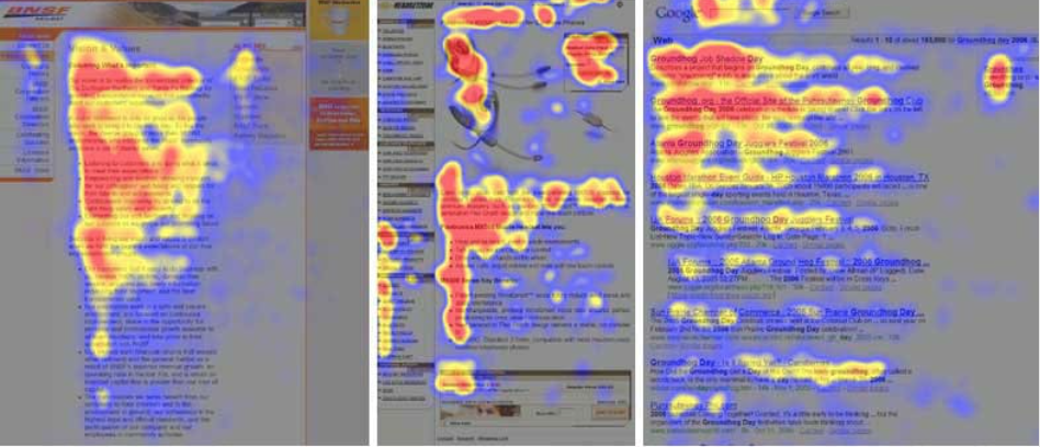
Today’s users interact with your page like their social feed rather than a favorite novel. Instead of reading and absorbing every piece of information on a page, users will scan the information they find most relevant. Positioning content in small chunks with clear headlines is a great way to hold your audience on the page. This layout strategy is called the “F-Shaped” layout. With an “F” layout, the eye stays on the left-hand side of the page, and the user can quickly scan the content as they scroll. When they find the information they want, they engage with that content, and the motion of the user’s eye creates flows in the shape of an “F.” A Google search result is an F-Shape layout that is quickly scanned for the information you need.
In Summary
Look at your page. Think about the layout. Can consumers easily find the information they are looking for, or is it buried in a sea of content? Ask yourself what you want your audience to do on your page. Now think about how easy is that action to do? Think about the sites you enjoy engaging with, what you like about them, and how easy it is to find what you want there? Put yourself in your audience’s shoes. What is the impression you are making with your site?
Happy Holidays and stay tuned as we countdown the 12 Days of UXMas!
Feel free to leave feedback, ask questions, or make additional suggestions in the comments.