The copy is finally written for an organization’s newest product landing page. The copy team’s bleary eyes have crossed every “T,” dotted each “I,” and per new brand standards, every serial comma has been painstakingly removed. A review board of 20 executives and 13 internal leaders from marketing, sales, AP, engineering, development, design, and legal have weighed in with tweaks, reorganizations, specification changes, scope creep, and full-on rewrites. All the feedback, at times conflicting, has been applied. After 32 revision rounds, the copywriting team’s carpal tunnel ridden fingers raise a toast to their success. After all the blood, sweat, and tears, users will ignore over 70% of the copy.
Embrace Brevity
It’s not that the text doesn’t matter. Words are essential, and quality control around what those words say is paramount. The issue I see most often is that organizations try to tell their entire story all in one place, rather than allowing users to decide if they’re interested in taking a deep-dive into a product or service. Information is often thrown in the face of users unsolicited. Users don’t want to be sold a product. Users are looking for an experience.
A Picture Is Worth 60,000 Words
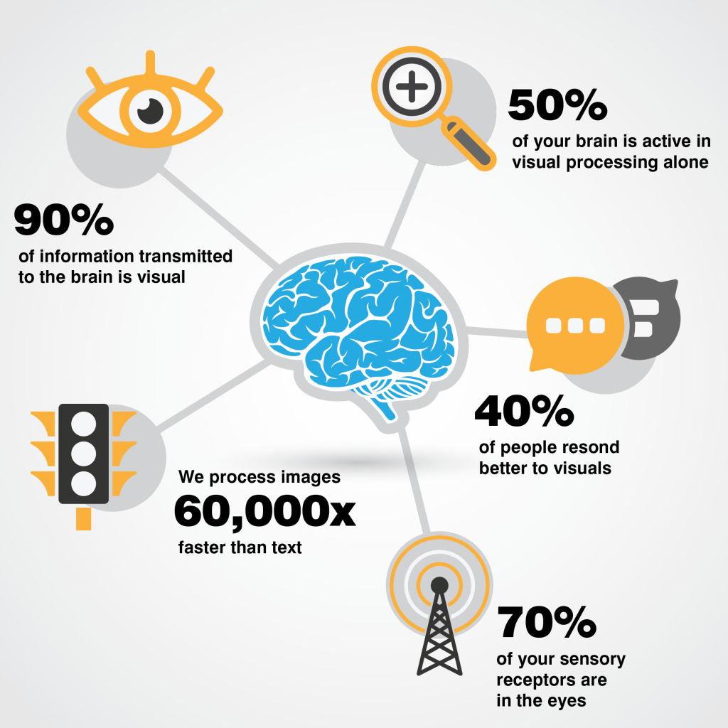
To build a better experience, marketers should think outside the text box. Since copy becomes white noise to users and is often scanned or skipped, it is our job as marketers to find new ways to connect with our audience and get our point across. One way to do that is with graphics and images. Humans are drawn to visual elements because we process visual data much faster than text. Since the beginning of human-kind, we’ve been continuously surrounded by visual queues, and we have evolved to quickly and efficiently process those visuals. 90% of all information transmitted to the brain is visual. In turn, we process visuals 60,000 times faster than text. That’s why 67% of consumers consider a quality image to carry more weight than product descriptions or consumer reviews.
Hollywood Magic
When there is more story than an image can handle, another alternative to text is video. Video is a fantastic tool for storytelling with some excellent benefits to user experience and marketing success. Viewers retain 90% of a message when watching a video compared to only 10% from reading. If that’s not enough, videos can increase engagement by up to 80%. Combine that data with the 82% of marketers who use video as part of their marketing strategy, and if you aren’t storytelling with video, you are being left behind.
Dreaming of a White UXmas
There is a general feeling among many marketers that open space is wasted space that needs to be filled with something to grab the user’s attention. The truth is the user’s eyes need a break. White space allows the user to pause and absorb the information without being overwhelmed by a continuous input barrage. Well-positioned white space can build curiosity and a desire to engage deeper with content. It’s vital to content flow to consider white space not as a void in the design but as an essential and intentional design element. White space is the punctuation of your design that gives a layout character, cadence, and flow. Don’t be afraid. White space is your friend.
Kondo-It
I visit so many pages that are so chock-full of content that they remind me of an episode of “Hoarders.” Users have to tip-toe through the space avoiding all the junk, trying to imagine what motivated the owners to keep it in the first place. Instead, find inspiration from Marie Kondo, commit yourself to clean design, be tidy, if it doesn’t spark your audience’s joy, get rid of it. Here are some additional copy tips to keep things in order.
Copy Organization Tips
- Visually group small amounts of related content.
- Separate copy blocks by surrounding them with a border or using a different background.
- Include the most critical points in the first two paragraphs on the page.
- Use headings and subheadings. Ensure they look more important and are more visible than body copy so users may distinguish them quickly.
- Start headings and subheadings with the words carrying the most information. If users see only the first two words, they should still get the following section’s gist.
- Bold important words and phrases.
- Use bullets and numbers to call out items in a list or process.
- Make sure your lists are parallel in structure, grammar, length.
- Provide users with a search feature to quickly find the information they need anywhere on your site.
- Cut all unnecessary content.
In Summary
Today’s consumers want to find information quickly and easily. Text is an important design element for any digital experience. Still, the written word is not always the best way to engage your audience. Organizing copy into easy to digest segments and communicating through visuals and video helps users absorb your story more efficiently and effectively.
Happy Holidays and stay tuned as we countdown the 12 Days of UXMas!
Feel free to leave feedback, ask questions, or make additional suggestions in the comments.